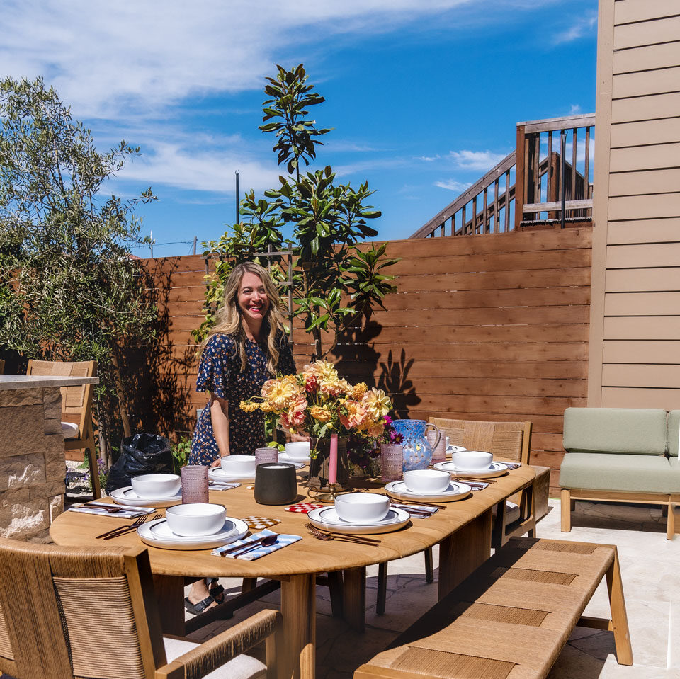
Kelly Huibregtse is a full-time NICU physician in need of a serene oasis at her SF home. She and her husband, Pat, also love to cook and entertain, so they decided to take their underwhelming backyard space and create a sanctuary and place to have friends visit. Careful planning included which appliances, surfaces, and suppliers could help complete their vision both on time and on budget. Following a detailed and tight schedule and working only with those suppliers who believe in a true collaboration helped to shape their new haven.
Before…
Kelly and husband Pat first compiled their wish list including the look, feel, style and function of their outdoor space. They then worked with the city to acquire the correct building permits and coordinated with online patio designer, Yardzen.
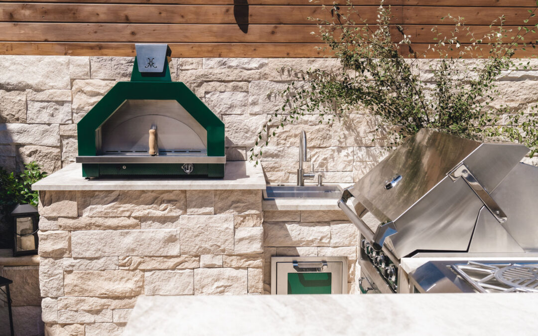
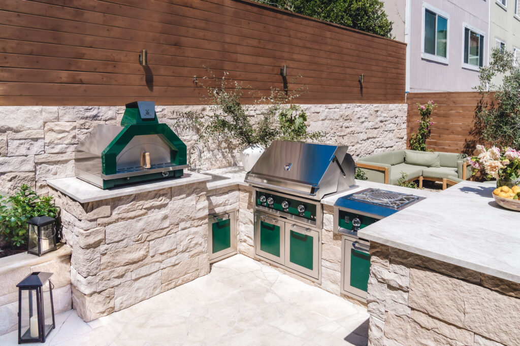
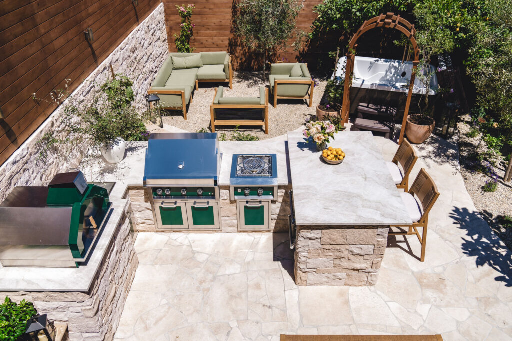
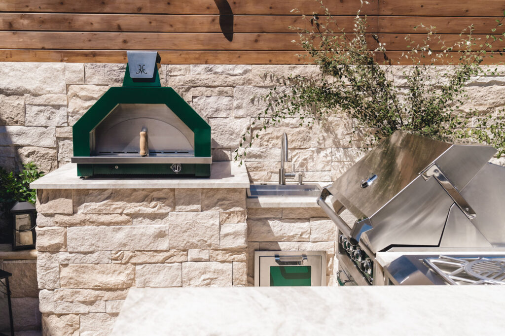
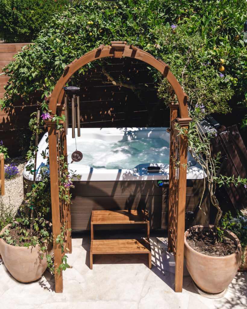
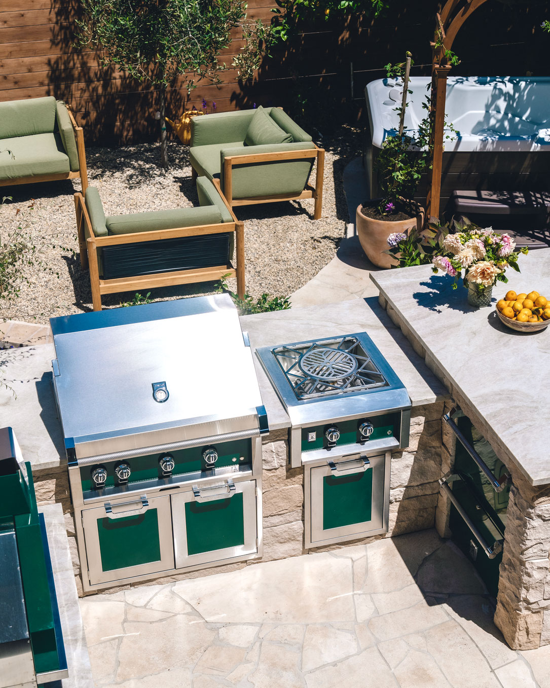
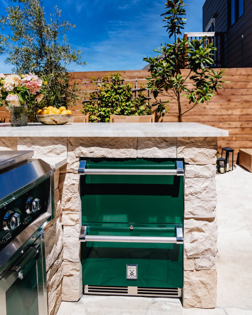
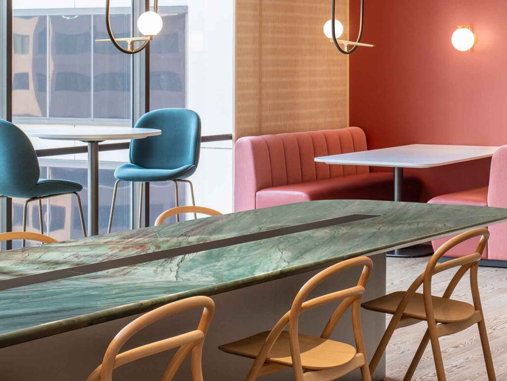
With Kelly’s and Pat’s input, Yardzen provided custom renderings which included layout and material suggestions. They selected Hestan outdoor appliances with green paneling, a spa from local dealer Creative Energy, chose landscaping and plants, and worked with IRG to select stunning quartzite slabs for the countertops. Professional stone fabricator, Joel Ayala from Special Marble & Granite, laid the final pieces perfectly into place. The project was completed by Mejia Landscaping.
…And After!
IRG: How much input from others do you generally ask for before beginning a design project?
Kelly Huibregtse: Usually, I start by myself or by discussing our needs with my husband. I look to Instagram, Pinterest, and AD online to start imaging the look and feel for the finished project. It’s funny because in this outdoor makeover, I originally wanted a sort of Old-World feel—more European—with lots of natural stone and a traditional timeless feel.
As the project developed and we discussed how we use our new backyard, we mixed in a few select modern conveniences. Our green Hestan outdoor appliances are good examples. The large quartzite counters were also a practical and stylish decision. This kept things feeling timeless not trendy.
IRG: What are the next steps you took after thinking of your “wants” of the project?
Kelly Huibregtse: This is the first project I’ve done where I used a design service to help bring my vision to life. Yardzen took our ideas and concepts and gave me a finished design that I could provide for our landscapers and for city permitting. Everything going forward followed their design quite closely.
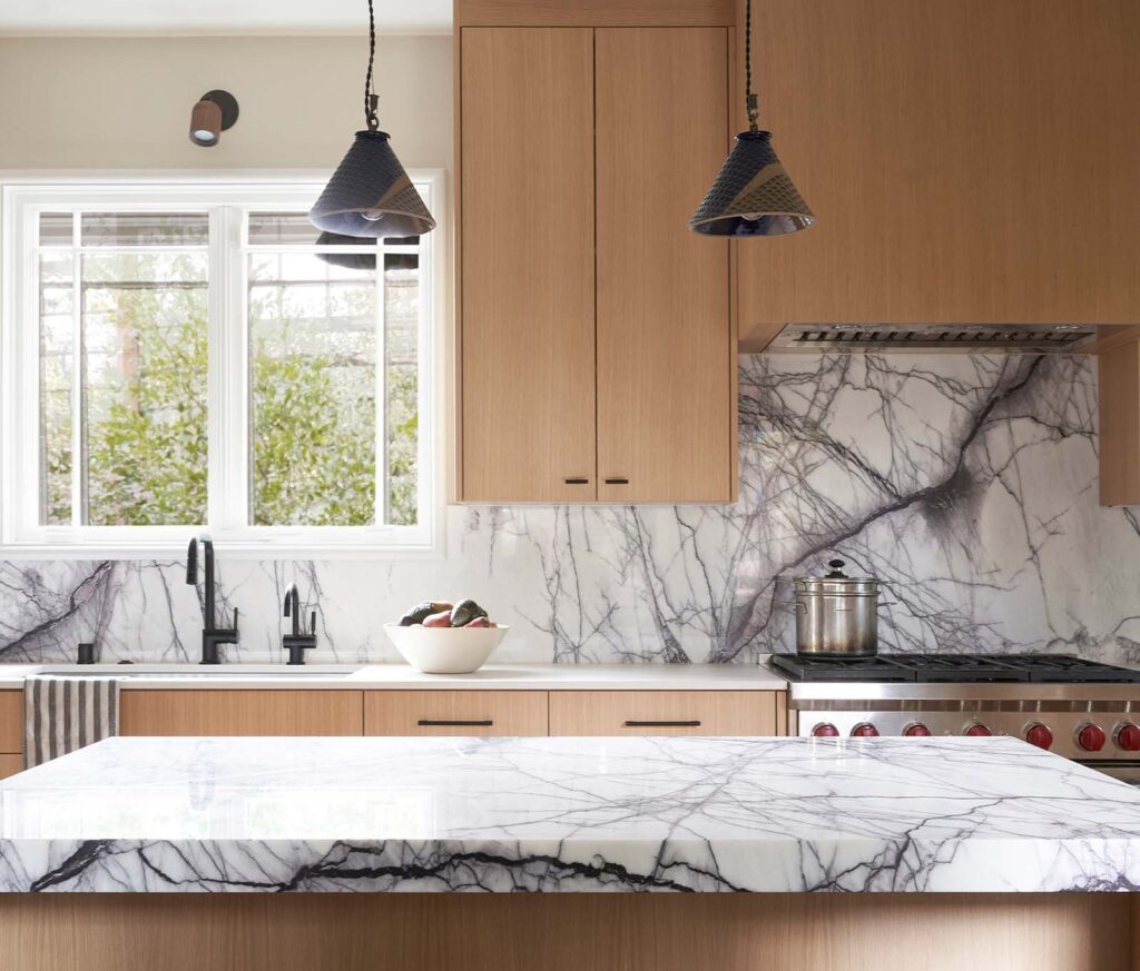
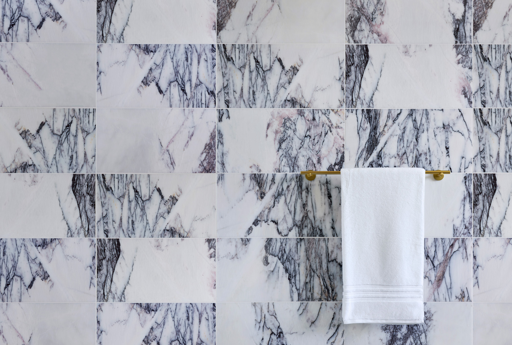
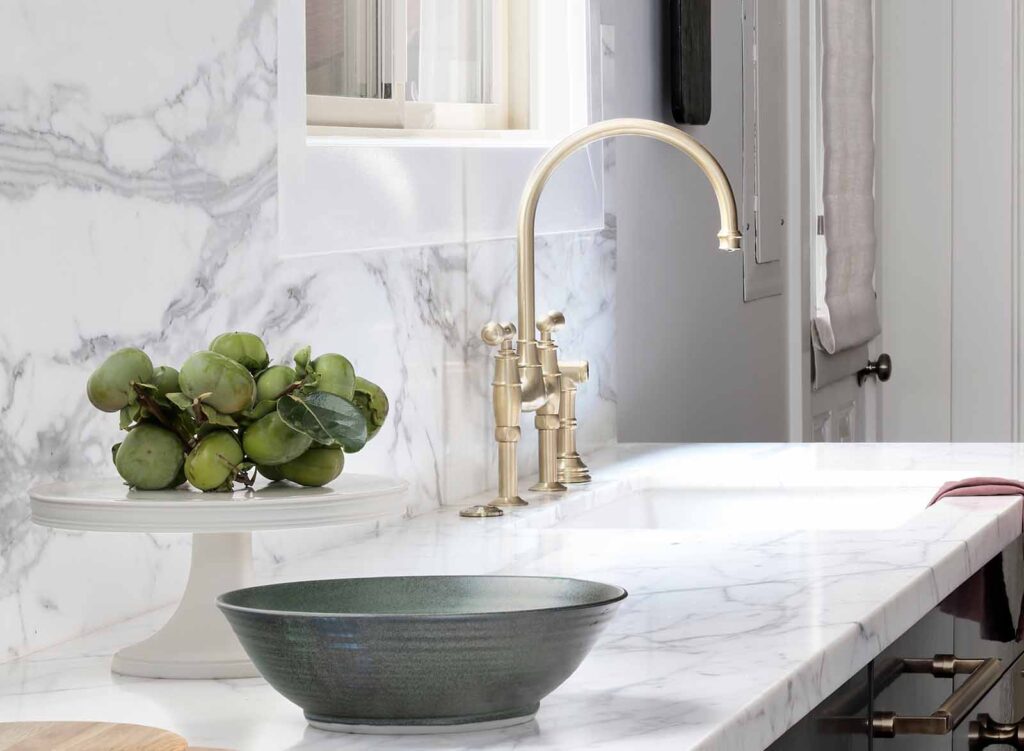
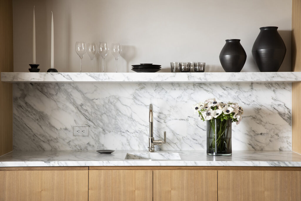
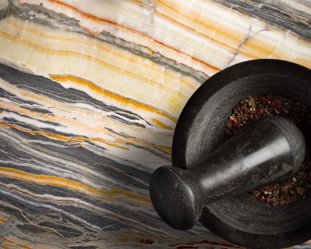
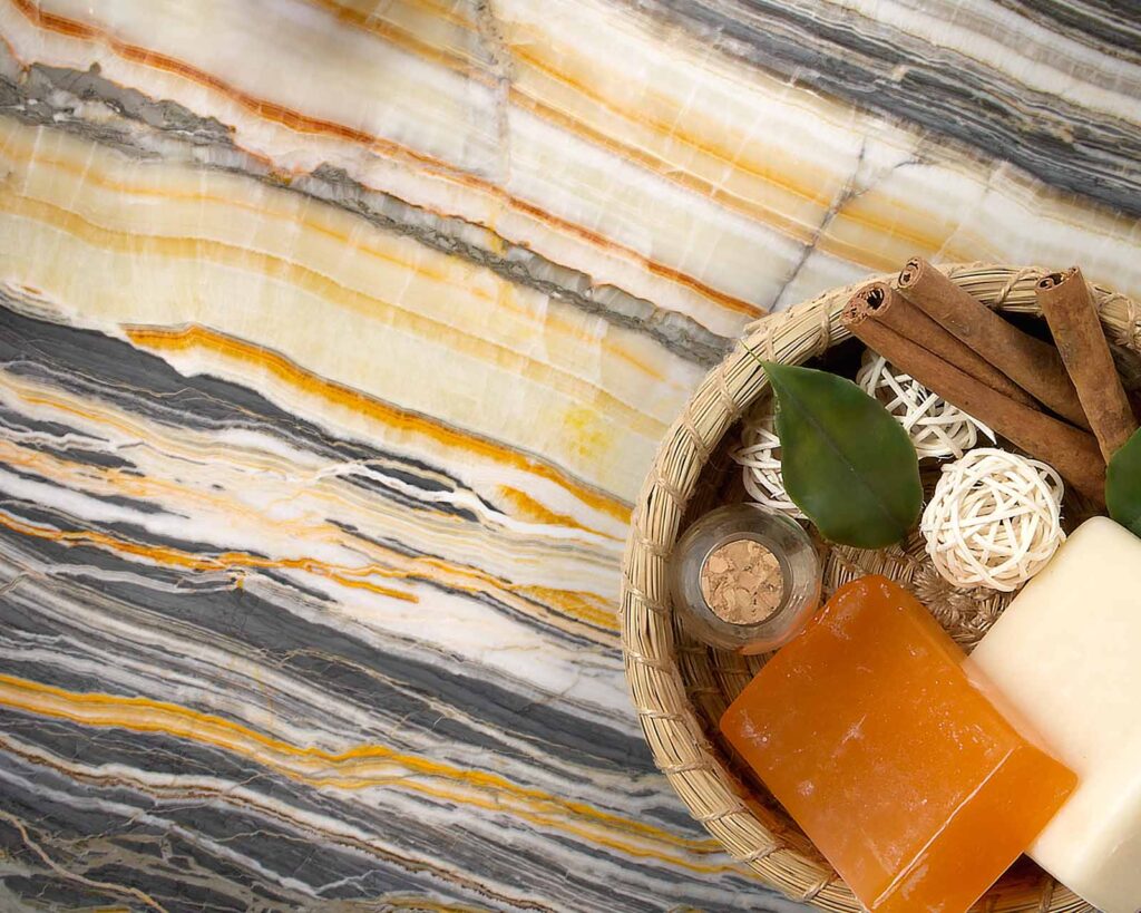
Kelly Huibregtse: Patrick had the idea to use Taj Mahal Quartzite. He loves the look, and it was perfect for this project. We knew we wanted a surface that could withstand the elements and we felt quartzite was more durable than marble for our use. We walked the aisles at IRG’s Brisbane location and found the perfect slab!
Taj Mahal is a neutral stone whose veining captures interest and shows its beauty. It’s also terrific at hiding stains on our cooking surface. IRG had so much in stock, which I knew they would. They introduced us to a wonderful fabricator Joel Ayala from Special Marble & Granite during our kitchen remodel and we used him again for this project. He was able to cut the stone to our exact specifications and carefully lift and install the pieces into place.
IRG: How was your experience working with IRG?
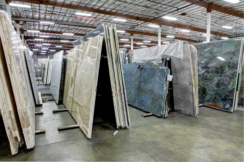
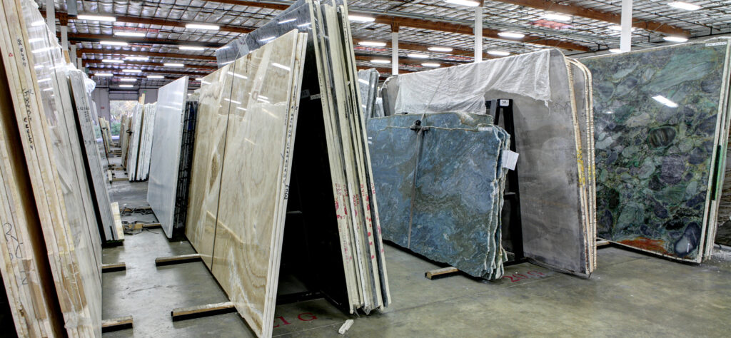
Kelly Huibregtse: I had worked with IRG before and this might sound odd, but one of my favorite things to do is go to their warehouse and just walk the aisles. It is so awe-inspiring. Even if you don’t have a project at the time, their vast selection gives you inspiration. There are quite a few stone suppliers, but I really think IRG is the best. I knew they would have what I wanted so I didn’t go and look anywhere else. Also, their customer service is just terrific. They make me feel right at home and comfortable. There’s no “attitude” just a friendly willingness to help you make a decision.
IRG: How long did the project take?
Kelly Huibregtse: I started design ideas and pulling permits in March and then worked virtually until we broke ground approximately May 1st. By mid-August the job was done, and I was in my hot tub!
IRG: How do you feel about the result? What’s next?
Kelly Huibregtse I’m super pleased and I don’t think I would change a thing. We’re taking a break for a few months but then I’m pretty sure we’ll be ready to take on a bathroom remodel. I’m already thinking full-on slab shower…stay tuned to IRG and A Side of Sweet!
Note: If you are a designer or a client who would like to have a recent project featured in IRG’s Design Talks Series, please contact: Jogreet Chadha at IRG (jogreet@marblecompany.com).
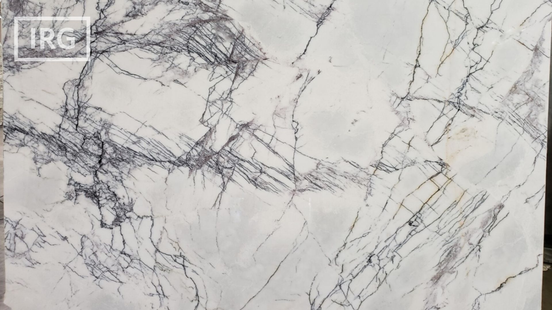
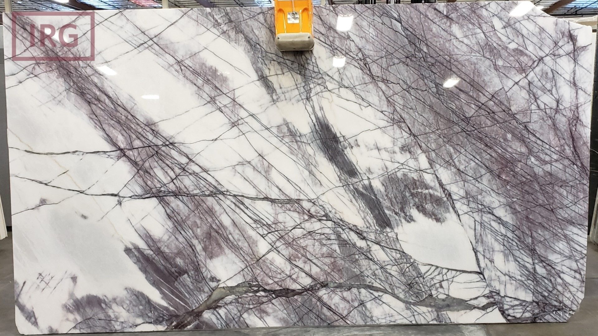
Finding the perfect balance between uniqueness, affordability, and functionality is key when it comes to remodeling your home or designing a new space. Interior designers or homeowners looking for remarkable stones to elevate their kitchen countertops or other surfaces, look no further than IRG’s Lilac Marble. This exquisite stone boasts unique violet colorations with an affordable price point —making it an ideal choice for those who desire color in their space while still achieving an upscale, white marble look.
Let Nature’s Brushstrokes Become Your Canvas
Prepare to be captivated by the enchanting hues of IRG’s Lilac Marble. Like soft pastel brushstrokes across a canvas, this stone’s delicate lilac tones gently dance with whispers of gray and white veining, as if nature herself painted a masterpiece. The subtle variations in color give each slab a distinct personality, ensuring that no two installations are ever quite alike.
Use affordable Lilac Marble in unusual places.
A Tapestry of Tranquility & Versatility
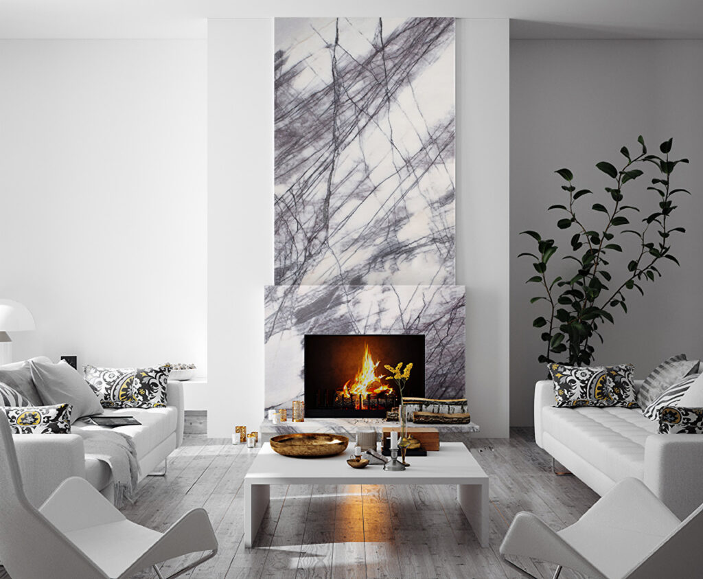
These calming lilac tones — reminiscent of a serene lavender field at dusk — can envelope any room in your home in a sense of tranquility. Commonly used on kitchen counters and waterfall islands, imagine the haven of relaxation in a bathroom engulfed in Lilac Marble; even a fireplace surround, backsplash, or shower wall brings a statement piece of sophistication and serenity to a spot where you can find solace in any busy day.
Make your fireplace fantastic with IRG’s Lilac Marble Slabs.
Be it a sleek, modern kitchen or a traditional primary bathroom; whether your cabinetry choices are rich wood tones or clean crisp whites, Lilac Marble emerges as the pièce de résistance that ties together any aesthetic with grace and charm.
Contrast this marble’s lilac hues with bold vibrant accents for a striking visual impact or embrace a more monochromatic palette to create a soothing and harmonious ambiance. Like an artist with a palette of colors, IRG’s Lilac Marble empowers you to create a space that reflects your style, taste, and artistic vision.
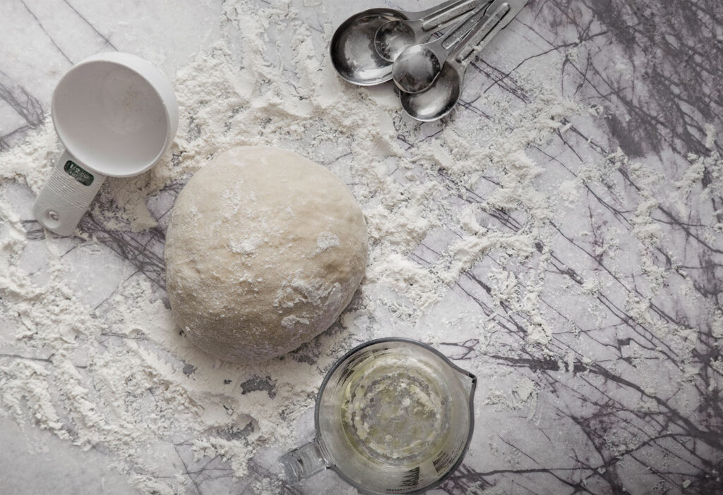
IRG’s Lilac Marble adds a sweet touch to baking.
Add Affordable Elegance
IRG’s Lilac Marble’s lower cost point doesn’t compromise the opulence and luxuriousness it brings to your home. Unlike more expensive white marble choices like Calacatta Viola and Calacatta Monet, with Lilac Marble you can achieve a high-end look in an economical fashion. In addition to slab form, Lilac Marble is also available in field tiles and various mosaics, enabling you to create a coordinated design throughout your space or to use sparingly for just a touch of color.
Incorporating tiles along with slabs allows you to play with depth, texture, and pattern. Whether mosaics, backsplashes, classic subway tiles, or smaller, more intricate formats not limited to large installations, tiles allow you to add visual interest and inspiration and to create a stunning focal point that elevates the entire space.
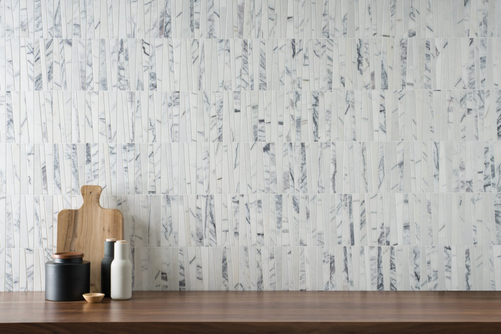
AKDO Pose Fino Lilac Subway Tiles
Coordinate a bathroom vanity with a gorgeous mosaic on the shower pan and niche to tie in the design and hues. Or use lilac field tiles on the bathroom floor, then add a coordinating mosaic backsplash to add a maximum pop of color.
Jeffrey Court Masquerade Ball Field Tile 10×20 in Polished Lilac Marble
Let IRG Be Your Guide
The knowledgeable and friendly stone specialists at IRG can show you beautiful, high-quality Lilac Marble slabs and tiles that truly showcase the unique colorations and elegance of this remarkable stone.
Call for an appointment or simply come in to the IRG showroom nearest you (Brisbane, Dublin, or Sacramento), and get ready to add a touch of sophistication and refined beauty to your home.
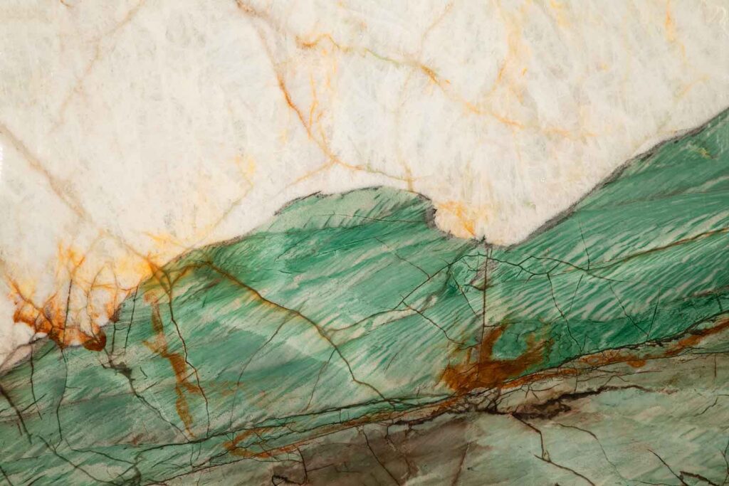
Slabs of this dreamy Aqua Green Polished Quartzite are perfect for a calming, natural space.
The color green has many positive aspects associated with it: nature, youth, safety, life, and hope being the most common. It is the most healing and soothing color for the eye to process, and has been proven to enhance vision, stability, and endurance in viewers.
Green often signifies cleanliness and healthy living, which is why packaging designers use green on environmental or health products. Green has an association with healing and has been proven to also help alleviate anxiety and depression, which is why hospitals often use the color.
Today, these healthful, restful connections make it an extremely popular and naturally beautiful color to use in interior design.
Fun Facts About Green.
Green is the color used for night vision goggles because the human eye is most sensitive and able to distinguish the most shades in that color.
You might not know that green is many people’s second most favorite color; blue being the first.
Green was a sacred color to the Egyptians representing the hope and joy of spring. The floors of their temples were often made from green natural stone.
Green has long been a symbol of fertility and was once the preferred color choice for wedding gowns in the 1400’s.
Jade green—created by a chemical reaction—was considered so beautiful in China that only the eyes of royalty could behold it, and it was known as mi se, meaning “mysterious color.”
The French “celadon” name was later given to this elegant color. The name is based on the literary character of a French shepherd who wore pale green ribbons.
So Many Greens. So Little Time.
Choosing which shade of green is right for you can be daunting to say the least. Because from emerald to olive to aqua, green comes in a huge range of jewel-like, leafy, or blue-infused shades. Each one also has its own distinct symbolism and associations.
Here are some examples: Inspired by the famous gemstone of the same name, emerald green is particularly recognized for deep color, rarity, and beauty. Hunter green has a rich, melancholic feel reminiscent of evergreen forests, while jungle green with its cooler blue undertone mimics the green tint of tropical plants. Both are now popular for modern kitchen designs.
Green can vary in shade (mixed with black) and tint (mixed with white). But there are also a broad range of green varieties that are mixed with other colors, such as yellow, blue, gray, and brown.
Yellow-greens like chartreuse (named after the French liquor which shares the distinctive color) or lime green have a lively, energetic feel and are often seen in children’s areas or work out rooms . Blue-greens such as aqua, sea green, and teal have a more subtle energy so those interior uses feel more calm and subtle, and are often used in bathrooms or meditation areas.
Gray greens like seafoam and sage are wintery and more somber than their yellow- and blue-green relations. A cozy library can benefit from the tone. Brown-greens like dark olive have a formal and dignified air, which explains why they are often selected for dining rooms and more elegant spaces.
Start With Your Style.
The cool emerald swaths of this Maestro Quartzite bring glamour and luxury to any setting.
Let’s say you fell in love with a particular shade of green that first saw on a restaurant placemat. You can’t stop thinking about the shade, but will it work on your shower wall or your kitchen counter?
The good news is that green is a very versatile color. It can be cool or warm, energetic, or soothing, subtle or strong. So, the place to begin your decision making is to consider not just the room but the design style where you want your green to go.
Nature Inspired
A nature-inspired theme gives off a more earthy and muted vibe. To achieve this look, focus on natural textures and shades that you would find outdoors, such as beiges, browns, and greens. You could consider a hardwood brown floor with a jade green sofa and tan cushions, or think about emerald green natural stone walls with beige sofas, brown woven baskets and plenty of plants.
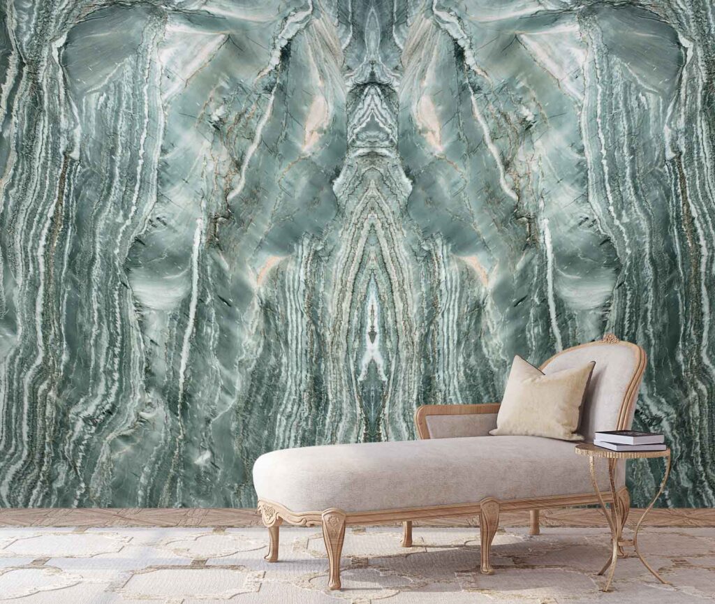
The calming deep greens of Aquabella Quartzite are calming and blend well with earthy whites, creams and browns.
Modern Industrial
Imagine a dark gray credenza, metal tables and lusciously veined jade green marble walls. Green can bring a sense of peace and neutrality to an industrial-style space. Just remember to balance the hard surfaces with a soft textured sofa or textiles in contrasting colors.
Mid Century Modern
Here’s where chartreuse is reborn. This mischievous color harkens back to a carefree era. Use it on attention-grabbing kitchen cabinets paired with white engineered stone countertops and red dinettes with graphic patterned seats. Or for those less adventurous, think yellow-green tea kettles and towels!
Sodalite Fantasy Quartzite highlights greens, blues, browns and absolutely stuns when bookmatched as a wall accent.
Tropical
Jade green is often said to be the same color as deep tropical bodies of water, and as such, it is a color that appears throughout tropical-themed interior design. This is a unusual look that works especially well in dining spaces and living rooms. The tropical decor style is about making bold statements, so don’t be afraid to combine several shades of green over several surfaces, textures, and furniture pieces.
Botanic Wave Quartzite is a stunning natural stone surface that creates a statement in any room it graces.
Botanical Bohemian
Botanical style interior decor themes center around flowers and foliage, which of course, have green features. Botanical Bohemian is a timeless design style that has gained a new popularity in the past decade.
If you want to create a quirkier bohemian style, try fuchsia next to green. Use this pinkish red color in small splashes against a strong green background, such as a green tile wall juxtaposed against small floral details or a leaf print wallpaper set behind a rose-colored chaise. Think roses and camellias against white marble for a feminine feel or wildflowers against ceramic tile to evoke a more free-spirited emotion.
Fresh Farmhouse
Green can have a very fresh, new-country appeal when paired with the right colors. This type of style works well in a kitchen, a casual dining room, or anywhere where you want the space to feel clean and crisp. Green/white/navy is a more sophisticated combination—achieving a refreshing and invigorating atmosphere while also lending an air of relaxation and comfort.
Color Suggestions to Use with Green
This slab of Emerald Green Quartzite is perfectly accented with salmon bolsters and turquoise upholstery, giving a calm, welcoming appeal to the environment.
Salmon – goes swimmingly with green because the contrast makes both colors appear more vivid.
Millennial Pink – this dusky pink shade has become hugely popular because of its soft, subtle tone. In a bathroom, choose green subway tiles set against dusky pink walls and add in hanging chandelier. In a bedroom, achieve a more formal look by opting for green semi-precious stone fireplace surrounds and gold metal-framed chairs upholstered in velvet.
Navy — In a predominantly green room, choose navy accents to help ground the space and add a dark contrast, such as a navy rug or a navy sofa.
Brown — works well with green because these are two colors that are often seen side by side in nature. This is a relatively “safe” choice to pair with green. Brown sofas will always be in style, as will brown upholstered bed frames, and brown ottomans.
Biscuit Beige — Biscuit is a dark shade of beige that is a warm neutral. Like brown, it works particularly well with green because it is a naturally occurring color. Biscuit Beige can represent sandy beaches, mountains, or desert landscapes, which are popular themes in today’s design world.
Fuchsia – Fuchsia adds fun! Use it to add small colorful details to the weight and depth of a green background starting point. Warning: overdoing it with fuchsia and green can make for an over-stimulating and slightly dated room.
We’re Seeing Green at IRG.
IRG’s in-stock selection of natural and engineered surfacing materials offers you the perfect opportunity to see all the green choices you have (granites, marbles, onyx, quartzites and tiles) all in one place! Choose the location nearest you and let the IRG stone experts guide you through your decision-making process to find the perfect green shade for your life and your lifestyle. Call or come in today.
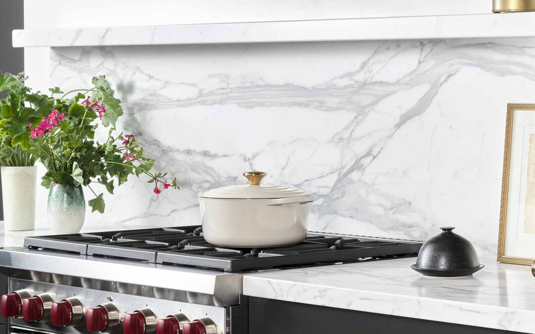
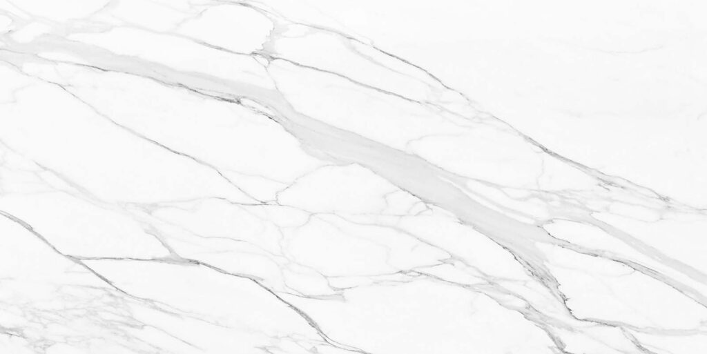
The Medici Family hailed from Florence, Italy in the first half of the 15th century. Their sponsorships in art and architecture during the Renaissance helped to create many of the world’s finest paintings, sculpture, and architecture. IRG’s Calacatta Medici Marble derives its name from the Medici family. As the name implies, it is an Italian beauty embodying the look and feel of traditional luxury. Even today, the classic Italian white marble enjoys vast popularity for its elegant, understated design in all forms.
2. Where can Calacatta Medici marble be used?
Desire for white marble bathrooms and kitchen countertops made of Calacatta has endured for centuries, yet Calacatta Medici is by no means an ordinary choice. Its crisp, elegant look complements a variety of interior styles and applications. More contemporary kitchen designs, for example, might pair this Calacatta with complimentary elements like black or brass fixtures.
Marble slabs require sealing. And because marble is sensitive to acids, you’ll need to use a cutting board religiously and wipe away tomato sauce and lemon juice quickly. But over the years, marble develops a patina—which is part of its charm and beauty. Despite requiring some attention, maintaining and sealing your marble is a DIY project that doesn’t take much time.
No one has a better selection of in-stock marble slabs that IRG. Visit an IRG showroom near you (in Brisbane, Dublin, and Sacramento) to see this spectacular stone in person. Then let the IRG staff help you create your own Italian masterpiece as you set the stage for the personal masterpiece you call home.
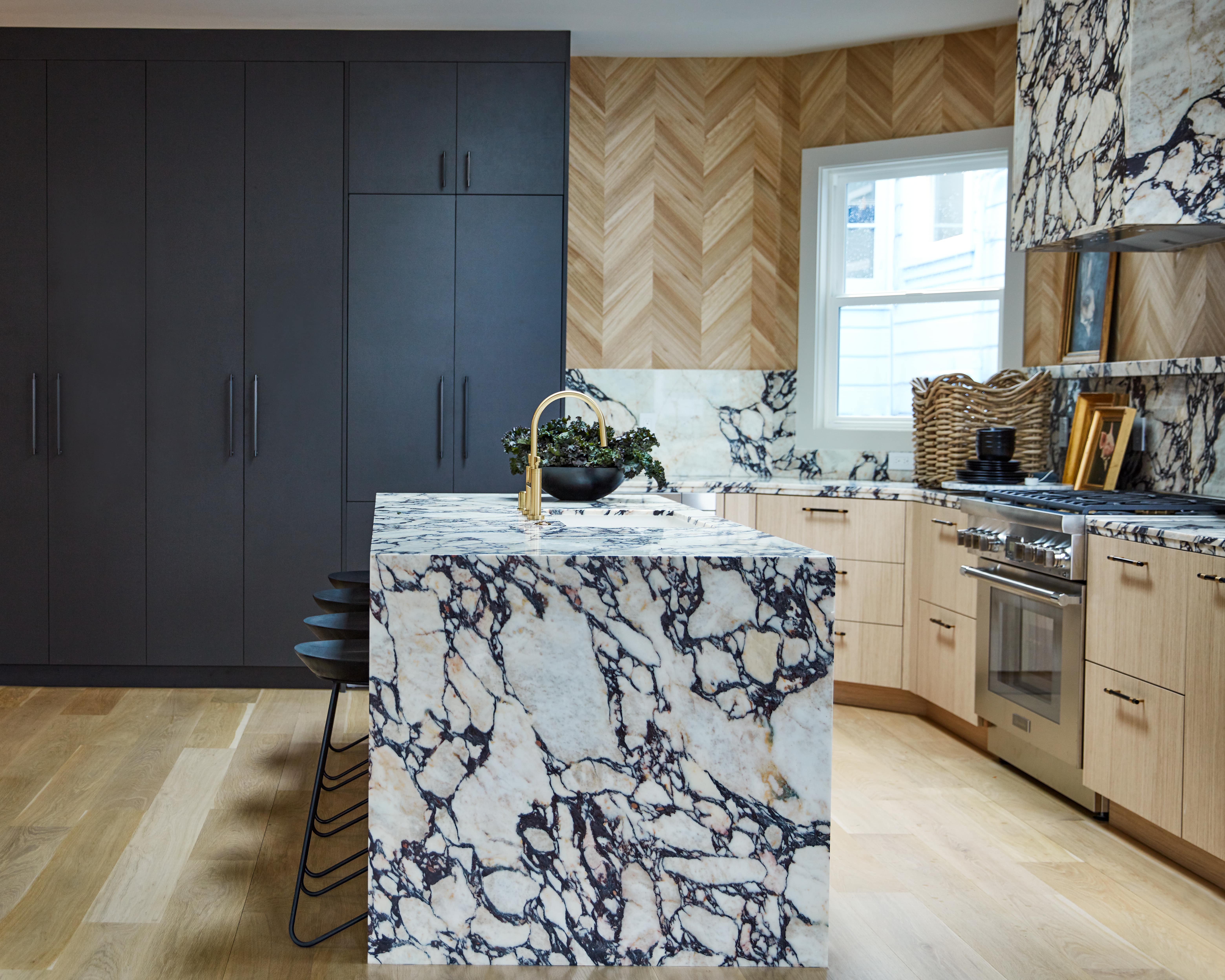
Today, we see cabinets in every imaginable color from bright yellow or white, warm browns, and cool blues, to dark black. Whatever you choose for your cabinet color, the right material and color of countertop can result in highlighting the best features of both. Don’t panic, it doesn’t have to be difficult to decide on the perfect combo. Here’s how to start:
Start with Your Home Itself.
The style of your home and your great room areas are factors playing a major role in your kitchen decisions. Is your style sleek and modern? Then a neutral palette inspired by nature with a splash of color might be appropriate. Casual, comfy country might call for blues and yellows or greens. Fun, fantastic bohemian space more your style? Then the sky’s the limit for your color palette choices
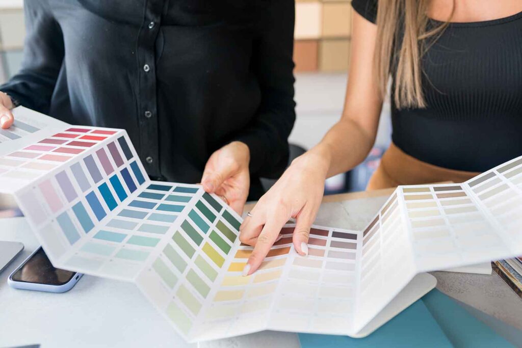
Go to your local bookstore, look through, and then buy, home design magazines with styles that appeal to you. Pay attention to the colors in the photos and see if they fit with your home style.
Pick a Palette and Go in Style.
We’ve written about choosing colors for areas in your home based on the feel and effect you’re wanting to achieve; calming, exciting, motivating, etc. Your kitchen is no exception.
The kitchen is often the central meeting place to socialize while prepping and enjoying meals or entertaining. The easiest color starting point is to choose two main colors, based on the mood you want to set, and then add touches of a third to set your own design tone. For example, start with a main palette of black and white, then add in touches of light birch, highlights of gold and a splash of silver.
But don’t stop your investigation here.
Consider Color: The Best Match.
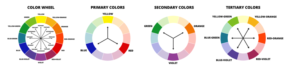
If you’re still daunted by color, you might look at a color wheel. A color wheel can help you develop a palette to choose from. You can pick and adjust colors based on color harmony rules. Here’s three to start with.
Complimentary Colors. These colors sit across from each other on the color wheel. As the name suggests, they complement each other, bringing out the best in each other.
Analogous Colors. These sit next to each other on the color wheel. They can share the same space just as comfortably in your kitchen. The result is a less contrasty more calming setting.
Neutral colors. These colors include, black, greys, whites, beiges, and brown tones. Neutrals are extremely popular in interior design right now. While not vibrant choices, these hues often form a safe background and starting point for entry into color decisions because you can change out you color scheme more easily with stronger color choices in accents and accessories.
Mix, match, compare, and contrast color. There’s plenty of online tools to help you visualize color choices. Here’s one of our favorites.
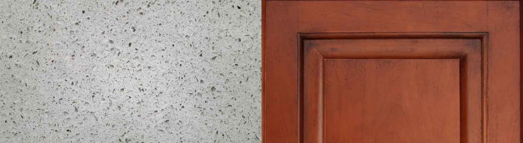
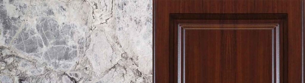
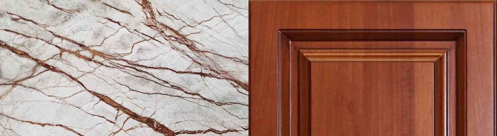
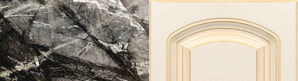
Cabinet or Counter: Which comes first?
We have good news on this choice: It doesn’t matter.
If you fall in love with a cabinet color or a countertop, just match it with the other. Understand, however, that not all cabinets go with all counter surfaces. For example, a white countertop with white cabinets might be too much of a good thing. The result can be, well, white. Instead of accenting the room, it can be one bland, monotonous room that doesn’t feel comfortable to live in.
Instead, you might select a cabinet color that you love, and look for a counter surface that has an accent of that color in its veining. For example, maybe you fell in love with white cabinets. Instead of white marble, which might look too sterile, maybe choose Black Moon Polished Marble, whose rich black will complement the cabinets and tie them together with the white veining.
There are many countertop choices, the most popular being natural stone, including marble, granite, quartzite, and soapstone. Engineered stone such as pental quartz or porcelain slabs are also choices many homeowners feel fit their needs. Occasionally consumers choose butcher block, stainless steel, or concrete for their countertop surfaces.
The most-used cabinet material is wood, with many styles to choose from, including open shelving.
If you’ve found a countertop surface that brings hearts to your eyes, hold a photo of that cabinet style (or better yet, get a sample door panel) against it to consider the effect of the combo. Likewise, an existing set of cabinets may be your starting point, consider that many can be successfully painted, modified, or totally changed out.
Color Counterpoints.
Sometimes, seeing is believing, so here are some well-chosen examples:
Warm-toned wood cabinets get extra oomph from a frosty white quartz or quartzite.Beautiful blue marbles are a luxurious choice with cherry woods or dark walnuts.Obviously wood grained cupboards pair well with blues and greens in granite, marble, or quartzite.Reddish oak shelving makes richly veined marble stand out even more stronglyDeep charcoal or very dark brown countertops can be enhanced with creamy colored cabinets.
And then there’s the New Countersplash!
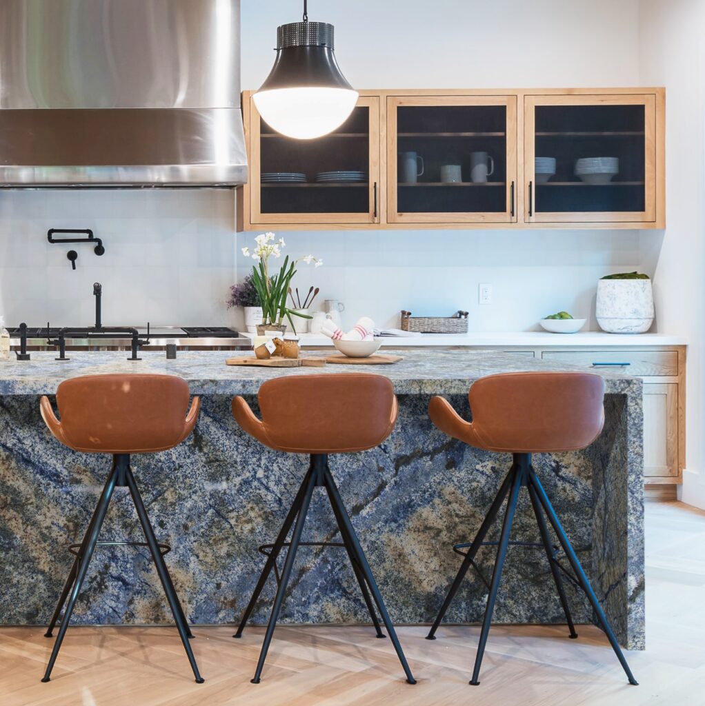
Thanks to the new and soaring interest in natural stone slabs, a technique has emerged using the same slab material on the backsplash area as the counter itself. This flowing look has given birth to a new term in the design world: Countersplash. When well matched, the look is a modern, seamless take on traditional backsplash treatments—very in and very worth a look.
When You’re Ready.
When you’ve thought it through and you’re ready, let IRG help you choose the right surface for the cabinets that you want. IRG’s experienced staff can give you the personal attention you need to make that choice from an unsurpassed in-stock selection of natural and engineered stone.
Q: Why is this stone so unique? A: The intense colorations of Picasso Onyx make it not for the faint of heart; it’s prized for its extreme movement of brown, black, cream and gold swirls. Known as the “sexy” stone, Onyx is quite rare and considered to be a semi-precious stone.
Q: Where can this stone be used? A: Create your own masterpiece by lining the walls of your living room with this breathtaking stone using four book matched slabs. Or make a grand statement by mounting a framed slab over a minimalist fireplace. IRG’s Picasso Onyx truly reflects the art of opulence.
Q: How do I care for this stone? A: Calcereous stones such as Onyx require more maintenance due to their more porous composition. We recommend sealing and cleaning regularly. Onyx Is sensitive to scratching and any liquids should be wiped dry immediately. Keep these points in mind when deciding where to place your slab.
Q: Where can I find Picasso Onyx? A: Picasso Onyx is only one example of the vast in-stock inventory of Onyx slabs at IRG. Visit an IRG showroom near you (conveniently located in Brisbane, Dublin, and Sacramento) and IRG’s staff of surface experts can guide you through your selection. Schedule an appointment today.
The IRG Blog is your resource for stone product information, ideas and inspiration. Use our informational articles, project features, and product spotlights to help create your vision, then come into one of our showrooms to bring your ideas to life!